23 January 2019

The Mystery of my finishing strokes


The mystery of my finishing stroke.
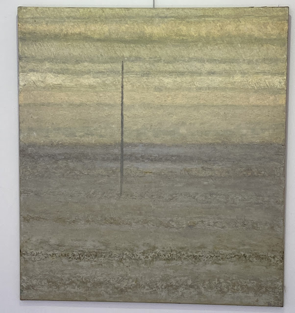
Upon my paintings in uppermost level you see a vertical brushstroke, a final touch as a calligraphy within an imaginary layer. These lines are thin and their length varies, seldom going from the upper to the lower edge, always out of a central position.
This sign is fruit of an independent colour research-choice and can be in dissonance with the general tonality of the work.

Many viewers ask: “ What is this line? What does it represent? Why it is there? This line could be seen as a personal seal, a method to proclaim my unicity. It stresses the
asymmetry of the composition that I have cared as long I remember painting.
For some inexplicable need at all times I cannot avoid dreaming my future work. Later in the actual making one transforms the empty surface by trials and errors and could go on inexhaustible. In a third mysterious minute the work cries out: “Basta! Stop it, do not touch it more!”.
In that point I experience both that the work is “myself” and that it has acquired an independent life. So then I put my signature and give it a name, its title, a child that deserves a name. And on this moment of acknowledgement of parenthood I draw my special stroke, that also means that I will respect the work’s integrity.

Night in death valley canvas 100 x 72 mix


Lumière au passé VII 2018 Canvas mixed 40 x 50 cm

03 July 2017

MONOCHROMES

 
Monochromes

Are multicolor paintings more artistic than monochromes?
Sculptors have abandoned colors since ancient times.The creativity in forms of architectural and design beauty do not need colors.
One feels a uniformly monochrome object too simple. Are single color surfaces with rough textures to be considered more expressive? Since the end of figurative paintings, famous examples of monochrome paintings were produced as Malevitch’s “White on white”, Richard Serra’s giant black encaustics, Y. Kleins blues, the “Achromes” of P. Manzoni,  the cuttings of Fontana and many others.
Is monochrome painting a kind of rebellion against classic style where painters searched a balance between “hot” and “cold” colors? Or a way to stress non-figurative nature of one’s painting?
Putting complementary or strongly contrasting pigments in one work can be perceived as drama expression, but we often associate strong emotions  with one tint.

I call monochromes my works with a dominance of one color and its near variations. I call these experiments “monochromes”, even when in them one sees well some “secondary” nuances within the same pigment family or small touches and strokes in contrasting pigments.

In my  production there are monochrome groups of “whites” (W), “grays” (G), “reds” (R), “blacks” (B), “yellows” (Y), “skin-colors” (Sk) and “texture” (T).